Guide
How to make an org chart in Excel by hand
Excel has no chart type that builds an org chart from your rows. You draw it with SmartArt: Insert → SmartArt → Hierarchy → Organization Chart, then type or paste the names into the text pane and indent them by level. If your staff list is already in Excel, importing it is faster.
Step 1: Make room on a separate sheet
SmartArt floats above the cells, so give it a sheet of its own rather than drawing over your staff list. Turning off gridlines (View → Gridlines) makes the chart easier to read on screen. If you plan to print, set the orientation to landscape under Page Layout now, so you can see where the page breaks fall while you work.
Step 2: Insert the SmartArt Organization Chart
- Open the Insert tab. SmartArt sits in the Illustrations group; on narrow windows the group collapses into a single Illustrations button.
- Choose Hierarchy on the left of the dialog.
- Select Organization Chart, or Name and Title Organization Chart if you want the job title on its own line.
- Click OK. A starter chart with placeholder boxes appears on the sheet.
Step 3: Copy the names from your cells
This is the one shortcut Excel offers. Sort your staff list so that each manager is followed by their team, select the names in that column and copy them. Open the SmartArt text pane with the arrow on the left edge of the graphic, delete the placeholder lines and paste: each row becomes a box on the same level.
Now set the hierarchy by hand. Click a line and press Tab to make it a report of the line above, or Shift+Tab to move it up a level. Remember that the chart keeps a copy of the text: when a name changes in your cells, the chart does not change with it.
Step 4: Add assistants, change the layout and style it
Select a box and open the SmartArt Design tab. Add Shape adds a colleague (After or Before), a manager (Above) or a report (Below); Add Assistant puts a staff position such as an office manager on a side connector. The Layout button switches the reports of the selected box between Standard and the hanging layouts that stack them vertically, which keeps wide teams from running off the page.
Change Colors and SmartArt Styles format the whole chart at once. For department colours, select the boxes with Ctrl and set a fill on the Format tab.
Alternative: shapes and connectors
If SmartArt’s layouts are too rigid, you can draw the chart from plain shapes. Insert a rectangle from Insert → Shapes, type the name, then copy it for each person. Join the boxes with an Elbow Connector from the Lines section: when its ends snap onto the dots on a shape, the line follows the box when you move it. Shape Format → Align lines boxes up and spaces them evenly.
This gives you full control, for example for a matrix with dotted lines, but it is the slowest method and every reorganisation means moving boxes again.
Printing an Excel org chart
Check File → Print before you print. Under Page Layout, set Fit to one page wide in the Scale to Fit group, or choose a larger paper size if your printer supports it. A SmartArt graphic that crosses a page break is cut in two, so move or resize it until it sits within one page.
Where Excel reaches its limits
Drawing in Excel feels natural because the data is already there, but the drawing does not use the data. In general experience:
- No link to the cells: SmartArt and shapes keep their own text, so the chart and the list drift apart.
- Levels are set by hand with Tab, one line at a time, even if your manager column already says who reports to whom.
- In our experience the chart becomes hard to read and rearrange somewhere past 30 boxes.
- Open positions, part-time roles and departments are only text and colour you format yourself.
- Every change in the team means editing the diagram again.
The faster way: import the list you already have
Your spreadsheet already contains the hierarchy in its manager column. Importing it turns that column into the chart, so the drawing never drifts from the data.
- Save the sheet as .xlsx or .csv with one person per row, a name column and a manager column. Our free import template shows the format.
- Upload it and check the column matching. The report lists missing managers, duplicates and reporting loops before anything is added.
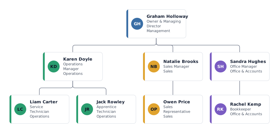
- The chart is drawn automatically, with department colours, open positions and FTE taken from your columns.
- When the list changes, import the new version: you see who joined, left or moved before you apply it. Export PNG, SVG, PDF or CSV on any plan; editable PowerPoint (.pptx) needs a Pass or Pro. Charts up to 25 people are free.
Frequently asked questions
Can Excel create an org chart automatically from my data?
Not with its built-in tools: neither the chart types nor SmartArt read your cells. You paste the names in and set the levels by hand, or import the spreadsheet into an org chart tool that reads the manager column.
Where is SmartArt in Excel?
On the Insert tab, in the Illustrations group. Choose Hierarchy and then Organization Chart.
How do I add a new level in an Excel org chart?
In the SmartArt text pane, click the person’s line and press Tab to move it one level down, or Shift+Tab to move it up. From the SmartArt Design tab, Add Shape → Below adds a report to the selected box.
Does the SmartArt chart update when I change my list?
No. SmartArt stores its own copy of the text. You have to change the chart by hand, or rebuild it from the list.
Is there an org chart template for Excel?
Yes, on our Excel import page: a free .xlsx and .csv staff list with the right columns. Fill it in and import it, and the chart is drawn from it.
Microsoft and Google are trademarks of their owners; mivochart is not affiliated.