Guide
How to make an org chart, step by step
To make an org chart, list every person with their job title and manager, decide what the chart is for, then place the top role and add each level below it. Mark vacancies, assistants and part-time roles clearly, check the draft with the people in it, and agree who keeps it up to date.
Before you start: decide what the chart is for
An org chart answers one question: who reports to whom. But the right level of detail depends on who reads it. A chart for new starters should show names, roles and maybe photos so people can find each other. A chart for management or a funding application needs the structure, open positions and working time. A chart on the website usually shows only the top two or three levels.
Decide the scope as well. A company of forty people fits on one page; a company of four hundred is easier to read as an overview of the leadership team plus one chart per department. Write down what each box should show (name, job title, department, perhaps email or a photo) before you draw anything, so every box ends up consistent.
Step 1: Collect the data in one list
The quickest charts start from a table, not from a drawing. Put one person per row with at least these columns: name, job title, department and manager. Optional columns such as email, working time (FTE), location or start date can be added later. If your HR system or payroll can export the employee list as a spreadsheet, start from that export instead of typing.
Before you draw, check three things. Everyone except the person at the top has a manager. Each manager is written exactly the same way as in their own row. And there are no loops, where two people are listed as each other’s manager. Fixing this in the list takes minutes; fixing it in a finished drawing takes much longer.
Step 2: Choose a structure and a layout
Most organisations are drawn as a top-down tree: the head at the top, direct reports on the next row, and so on. That works until one manager has many reports, at which point the row becomes too wide. Stacking those reports in a vertical list or a compact grid under their manager keeps the chart narrow without changing what it says.
Think about the structure you need to show, too. In a simple line organisation every person has exactly one manager. Many companies add staff positions, such as an assistant to the managing director or a data protection officer, that advise a manager without leading a team. Project-based or matrix organisations also have secondary reporting lines, which are usually drawn as dotted lines.
Step 3: Draw the top levels first
Start with the top role and their direct reports, then work down one level at a time. Keep every box at the same size and every level on the same row; uneven boxes make people look more or less important than they are. Group people under their own manager rather than by department colour alone, because the lines are what readers follow.
If you are drawing by hand, finish the full skeleton with names only before adding job titles or formatting. Restructuring a skeleton is quick. Restructuring a fully styled chart, where every text box has been resized by hand, is where most of the time goes.
Step 4: Add the special cases
Real organisations rarely fit a clean tree. These are the cases worth showing explicitly, with the same convention every time:
- Staff positions and assistants: place them beside their manager on a short side line, not in the row of reports, so it is clear they do not lead the team below.
- Open positions: keep the box in place with the job title and a clear label such as “Open position”, so the chart shows the structure you are hiring for, not just who is there today.
- Part-time roles: add the working time (for example 0.5 FTE) to the box rather than leaving it out; it matters for anyone planning workload or budgets.
- Dotted-line reporting: draw a dashed line to the second manager and keep the solid line for the primary one.
- Interim and shared roles: write “interim” in the title, or show the person once with a note, rather than duplicating their box.
Step 5: Make it readable
Use one colour per department and keep it the same everywhere the chart appears. Keep job titles short, and show no more than three or four lines of text per box. If the chart no longer fits on one page at a readable size, split it: one overview and one page per department is easier to read than a giant poster in tiny type.
Add a title and the date the chart reflects. An org chart without a date is a guess, and readers have no way to tell whether it shows last month’s structure or last year’s.
Step 6: Check it with the people in it
Send the draft to each manager and ask them to check their own team: names, spelling, titles, who is missing and who has left. Ask HR to check the open positions and working time. The most common errors are people who changed teams recently, wrongly spelled names, and assistants drawn as if they managed a team.
Step 7: Share it and keep it current
Choose the format by where the chart will live. A PDF suits printing and email. A PNG image works in slides, documents and intranet pages. SVG stays sharp at any size. For a presentation that others will edit, an editable PowerPoint file is the most practical.
Then agree who owns the chart and how often it is updated. An org chart is out of date after the first hire, move or leaver, so the update process matters as much as the first version. The guide on keeping an org chart current covers this in detail.
Which tool should you use?
Microsoft Word, PowerPoint and Excel all include SmartArt, which draws a basic hierarchy from an indented list. It is fine for a handful of boxes and needs nothing new. Google Sheets has a built-in org chart chart type that reads a name and a manager column. In our experience all of these become slow once a chart passes a few dozen people or changes often, because every move is done by hand.
A dedicated org chart tool is worth it when the chart is large, needs open positions, part-time roles or staff positions, or has to be redone after every reorganisation. These guides cover each option:
The faster way from your staff list
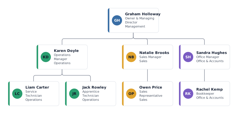
If you already have the list from step 1, you do not need to draw anything. mivochart reads the spreadsheet and lays out the chart for you, including the special cases from step 4.
- Save your staff list as .xlsx or .csv with a name and a manager column, or start from one of the templates.
- Import it: the columns are matched automatically (English, German and French headers), and a report flags missing managers, duplicates and loops before anything is added.
- Adjust the chart in the editor: tree, list or grid layout per team, department colours, open positions, FTE, assistants and dotted lines.
- Export PNG, SVG, PDF or CSV on any plan. Editable PowerPoint (.pptx) and print PDFs in A3, Legal, poster tiles or one page per department come with a Pass or Pro.
Frequently asked questions
What information does an org chart need?
At minimum, each person’s name, job title and manager. Departments, open positions, working time and contact details are useful additions, depending on who reads the chart.
What is the easiest way to make an org chart?
Start from a spreadsheet with one row per person and a manager column, then let a tool draw the chart from it. Drawing box by box only makes sense for very small teams.
How do I show an assistant or staff position?
Place the box beside the manager on a short side connector instead of in the row of reports. In Office SmartArt this is the Assistant shape; in mivochart it is a staff position.
How should vacancies appear on an org chart?
Keep the box with its job title and label it clearly as an open position, often with a dashed outline. That way the chart shows the planned structure, not only current staff.
Can I make an org chart for free?
Yes. Office SmartArt and Google Sheets are included with those products, and mivochart is free for charts up to 25 people, with PNG, SVG, PDF and CSV export.
Microsoft and Google are trademarks of their owners; mivochart is not affiliated.