Guide
How to make an org chart in Google Docs, Sheets and Slides
Google Sheets has a built-in org chart: put names in one column and each person’s manager in the next, then choose Insert → Chart and the Organizational chart type. In Google Docs you draw boxes with Insert → Drawing; Google Slides has ready-made hierarchy diagrams under Insert → Diagram.
Google Sheets: the built-in organizational chart
Sheets is the only Google app that builds an org chart from data. Set up the sheet with one person per row: the person’s name in the first column and their manager’s name in the second, written exactly as in the manager’s own row. Leave the manager cell empty for the person at the top. An optional third column can hold text that appears when you hover over a box.
- Select the two (or three) columns, including the header row.
- Choose Insert → Chart.
- In the chart editor’s Setup tab, open the Chart type list and pick Organizational chart (it is listed under Other).
- Make sure the first row is used as headers so it does not become a box.
- On the Customize tab, adjust the box size and colours.
What to know about the Sheets org chart
Its big advantage is that it stays linked to the cells: change a manager in the sheet and the chart redraws. The trade-off is that it is a chart, not a design tool. Keep these points in mind:
- Names must be unique. Two people called “Alex Kim” become one box, so add an initial or a department to tell them apart.
- The manager cell has to match the manager’s name exactly, including spaces; otherwise the person appears as a separate tree.
- A box shows only the first column. To show a job title, put name and title in the same cell, and use that exact text in the manager column too.
- There are few styling options and no photos, department colours, assistant boxes or dotted lines, and wide organisations become very wide charts.
- To use the chart elsewhere, download it as an image from the chart’s menu.
Google Docs: draw it with Insert → Drawing
Google Docs has no org chart feature, but its drawing canvas is enough for a small team.
- Choose Insert → Drawing → New.
- Use the Shape tool to draw a box and double-click it to type a name. Copy and paste the box for each person so they stay the same size.
- From the Line menu, choose Elbow connector and drag from one box to another; the ends snap to the dots on each shape and follow the box when you move it.
- Click Save and close. To change the chart later, select it in the document and choose Edit.
Google Slides: Insert → Diagram → Hierarchy
Google Slides offers a diagram panel under Insert → Diagram. Choose Hierarchy, pick the number of levels and a colour, and insert one of the suggested layouts. The result is a group of ordinary shapes and lines: you replace the placeholder text with names, and adding a person means copying a box and drawing its line. That makes it a good start for a leadership slide and a poor fit for a whole company.
Org chart templates for Google Docs
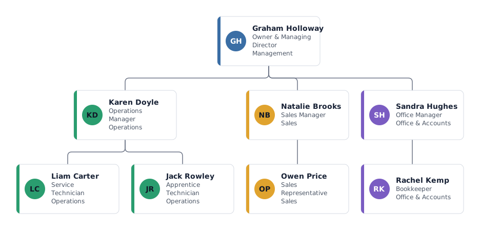
Google’s template galleries cover documents, presentations and spreadsheets in general, so an org chart in Docs usually starts as a drawing, a Slides diagram or an image from another tool. The mivochart templates are complete example organisations: open one, replace the people, export it as a PNG and add it to your document with Insert → Image.
Where the Google tools reach their limits
Each of the three apps covers part of the job. In general experience:
- Sheets reads data but offers little layout or design: one line of text per box, no photos, colours per department or staff positions.
- Docs and Slides look better, but every box and line is placed by hand, with no import from a list.
- In our experience hand-drawn charts become hard to maintain somewhere past 20 or 30 boxes.
- Every reorganisation means redrawing, and nothing records what changed between versions.
The faster way from your staff list
If your staff list lives in Google Sheets, you can keep it there and still get a properly laid-out chart.
- In Google Sheets, choose File → Download and save the list as .xlsx or .csv.
- Import the file into mivochart. Columns such as name, job title, department and manager are matched automatically, and a report flags anything that does not add up.
- Arrange the chart with tree, list or grid layouts, department colours, open positions, FTE and staff positions.
- Export PNG for Google Docs and Slides, plus SVG, PDF or CSV, on any plan. A .pptx export (Pass or Pro) can usually be brought into Slides with File → Import slides; check fonts afterwards. Charts up to 25 people are free.
Frequently asked questions
Does Google Docs have an org chart template?
Google Docs has no org chart feature or dedicated template. Draw one with Insert → Drawing, or insert an image of a chart made in Google Sheets or another tool.
How do I make an org chart in Google Sheets?
Put each person’s name in one column and their manager’s name in the next. Select both, choose Insert → Chart, and set the chart type to Organizational chart.
Why is someone missing or on their own in my Sheets org chart?
Usually the manager cell does not exactly match the manager’s name, or two people share the same name. Fix the spelling or make the names unique.
Can I show job titles in a Google Sheets org chart?
Only as part of the box text: put name and title in the same cell and use the same text in the manager column. The optional third column is shown only when hovering.
How do I put a mivochart chart into Google Docs or Slides?
Export it as PNG and choose Insert → Image → Upload from computer. PNG is the safest format for Google Docs.
Microsoft and Google are trademarks of their owners; mivochart is not affiliated.